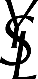
Many people are familiar with:

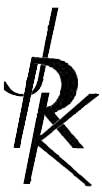
Less people are familiar with:

Lessons learned from this effort:
* The YSL letters are not part of a font. It is a straight up logo.
* Making letters from letter pieces, because there is no font, is hard!
* Imputing letter design from a limited alphabet (e.g., there is no K and no example of what the R’s curve would be as a big letter in the full YSL logo) is harder!
* The layout isn’t the only that matters for this design. The letters matter, which is why my version is much less powerful (the “R” is problematic).
* Making the letters look like they interlock is critical. YSL works nicely because of the “S”. I used letter shadowing–hiding part of the “K” behind the “R”–to force a similar effect. I should have had the bottom of the “J” appear in front of the “R”.
Pingback: Jason’s : Things I Learned this Week